Mobility as a Service
Role
— UX Designer and Strategist
Year
— 2019
Status
— Complete
Lula is a South African ride-sharing platform which connects corporate commuters to private shuttles – getting users to work reliably and safely.
I was brought onboard to lead the UX design process for the startup's new cross-platform commuter app. The business had recently pivoted to a new direction and wanted to create an app allowing corporate commuters to book, track and ride on shared shuttles to and from work.
The key difficulty we addressed was the novelty of having shuttle routes being crowd-sourced based on location. If there are not enough users in a neighbourhood going to the same destination, that route is not feasible.
The Problem
During my initial evaluation, I found that the existing app was unsuitable for the company’s new direction. As I needed to design a completely new app, I led a workshop with stakeholders to define the vision and processes for the current business direction.
This helped me clearly define the problem – I had to design an app that allowed users to book and ride on shuttles going to and from work. However, it also needed to allow users to crowdsource new routes, if none existed for their path to work or their preferred days and times.
Competitive and Industry Research
I conducted a competitive analysis against five other ride-sharing and corporate commuter based applications. I evaluated their services, web presence as well as their app functionality – analysed on a screen by screen basis. These evaluations referenced usability heuristics to assess the competitor's platforms. I also assessed the reviews of competitor apps in App Store and Google Play Store. This gave me insights into common usability problems. One of the key takeaways of the competitive analysis was that users would prefer not to have new features (such as ETAs on their trips), if these features are not effective/accurate.
User Research
The existing user base was not accessible via survey - therefore I leveraged the knowledge of customer-facing employees who engaged with the clients on a daily basis. These employees supplied me with user demographics as well as their needs and lifestyles. To supplement this research, I consulted reports from several studies and paper written about the South African market. This research was condensed into personas. I created four personas and identified the primary needs of each.
Product Design, Strategy & Workshops
I facilitated further ideation workshops to refine the design and vision for the app. The basis of these workshops was the Design Thinking methodology. I enables the core stakeholders to define and refine their offering into a Mobility as a Service platform which worked towards their business goals as well as serving an existing user need. This exercise resulted in a concise priority list of relevant features and a clear understanding of the overall goal of the application.
Another outcome from this exercise was being able to define the multiple use cases and confirming the essential user flows – which consisted of;
Another outcome from this exercise was being able to define the multiple use cases and confirming the essential user flows – which consisted of;
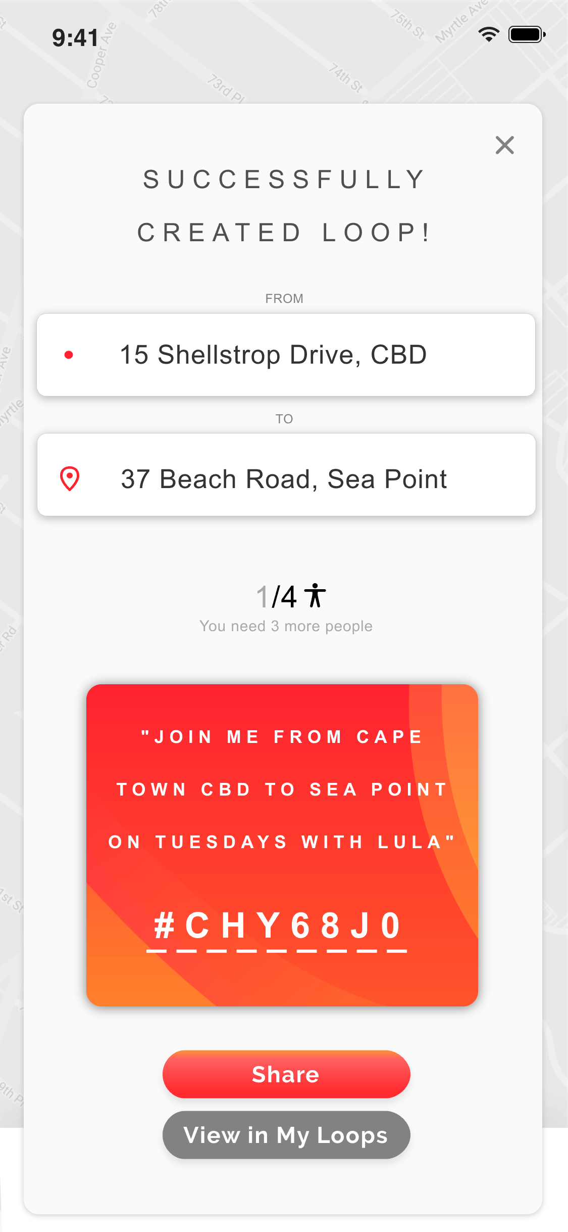
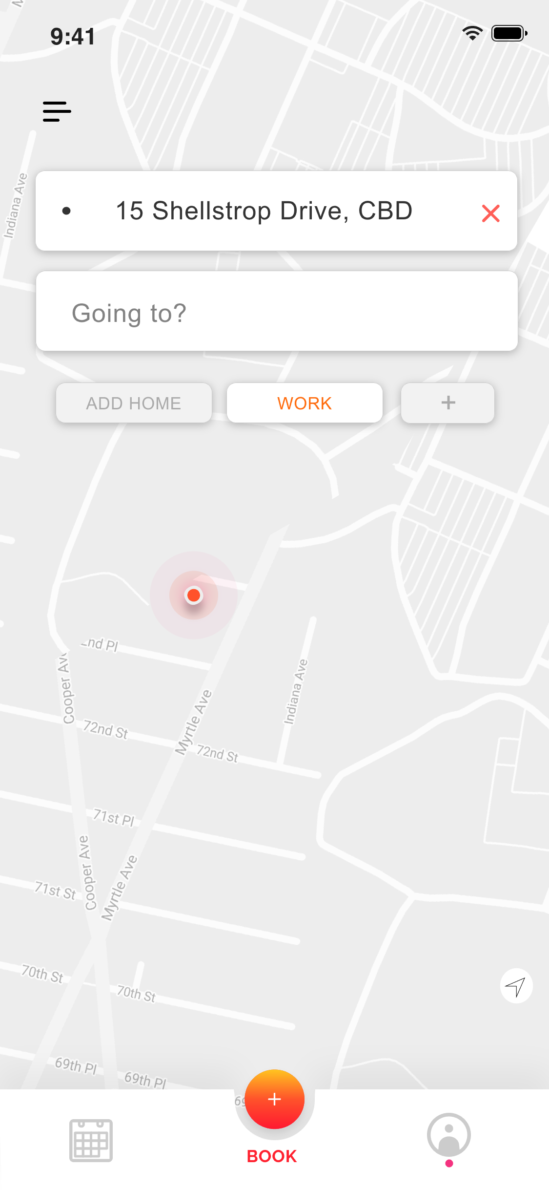
- booking a currently available route (rebranded “Loop”)
- creating a new Loop for other users to sign up for
- signing up for a newly created Loop before it’s live
- tracking your Loop as it picks you up and drops you off
This system would allow users to create, crowdsource and track Loops - however the overall process could potentially be slow while a user waits for others to fill the slots on the new Loop. An unexpected solution to this problem was uncovered during the workshops. The idea was to allow users who found Loops arriving near their desired location, to join that Loop and then walk the further short distance to their destination with assistance from a maps application.
Low Fidelity Testing
Working to an agile methodology allowed me to test frequently and quickly. I created a low fidelity prototype representing the initial proof of concept features and parameters defined to this point. This paper prototype mimicked true interactivity through a Wizard of Oz method.
In order to extract the most value from this rapid testing stage - I opted to test with potential and current users in the context of use, i.e. their place of work. These users were self-selected at random and those who participated had a few tasks to complete without any leading hints. The goal of this test was to determine whether the proposed functionality would be useful, usable and/or learnable.
This testing stage gave us valuable insights into user's outlook, behaviour and needs. The ability to track the Loop was a particularly successful flow in this stage of testing.
User Flows
The results of the agile testing allowed me to pare down the platform's components to a simpler and more usable experience. The user journeys allowed me to create detailed representations of how each of the core User Flows would unfold on the application. The User Flow diagram was elevated with the use of low fidelity wireframes enclosed in the screen outlines to accompany the names. These flows were presented back to the business for examination and validation.
Information Architecture
Once validated, these flows and wireframes helped define the basis of the Information Architecture for the mobile application. The Information Architecture was designed with IA Principles in mind in order to create a learnable and scalable platform. The goal was to create an IA which would correspond with a new users' expected mental model when using the app. Familiar patterns from online booking flows and ride-sharing applications were leveraged to ease the user into a new way of creating, scheduling and riding with a crowd-sourced ride-share service.
High Fidelity Design
With user flows and IA validated by the key stakeholders, I moved onto the high fidelity wireframes. I used Invision Studio to create screens for every element indicated in the information architecture. These screen designs followed Nielsen's Usability Heuristics as well as the other needs of the users. Once every screen had been created, I created an interactive high-fidelity prototype. The prototype followed the key user journeys we wanted to evaluate in the contextual scenario of a new user's experience with the application.


High Fidelity Usability Testing
The goal of the usability testing phase was primarily to find any significant/critical usability flaws in the flow and structure of the prototype. Participants were briefed to focus their attention on how they would navigate through the prototype. I used a Think-Out-Loud User Test in order to discern a user’s ability to complete core tasks (as this would validate or invalidate the structure of the user flows and key features). A Think-Out-Loud approach meant that users would talk me through their thoughts and reactions as they moved through the prototype - giving me valuable contextual feedback on top of metrics for task success/failure.
We determined the selection criteria to be potential clients - as it would be key to test with users who didn't already know how the service worked. Further criteria stipulated that participants should be working adults with a smartphone, who commute to work on a regular basis. Ten participants who met the criteria were selected and they were given two tasks to complete;
- to book a Loop to work on certain days
- to create a new Loop
These tasks were based on the core user flows identified earlier. Users interacted with the prototype with minimal intervention or prompting, while talking me through their thoughts.
Results and Takeaways
8/10 users could complete the first task without prompting and 10/10 users could complete the second task without prompting. No critical usability flaws were uncovered. Some minor changes were recommended as a result of the testing.
After an initial run-through, participants were confident in their understanding of how to complete both tasks – indicating that this platform/service was based on a learnable system. The areas of hesitation/confusion occurred when users didn’t read the UX copy in prompts/descriptions. These prompts were often unique terms specifically pertaining to this solution and couldn't be replaced with visual cues. In order to mitigate these potential issues, I recommended using an onboarding wizard tutorial when users first log in - taking users through key features in the app.
Some users enjoyed and understood certain UX copy terminology while other were confused (e.g. “book” vs “confirm”). I recommended A/B testing as a suitable method to decide on which generalised terms to use. I also recommended that terminology unique to Lula (e.g. “Loops”) needed to be explained in FAQs, marketing and onboarding thoroughly.
Many users expressed that while it was great that the app showed the user exactly where they are in their journey on a Loop (from waiting for the driver to being dropped at the destination) – a key concern that popped up is how it accurate these ETAs and times-to-destination would be in practice. My takeaway here is that even designs which abide by best practice and give the user knowledge/control over where they are in the process, need to be prepared with backup protocol for if the underlying system fails or is inaccurate.
This project was an exciting challenge in designing for a novel system and I particularly enjoyed working on a service which is creating a more reliable, safe and eco-friendly solution to working peoples' commute.